


Recently we teamed up with the Cyentia Institute to examine the current state of third-party cyber risk in the healthcare sector. In this post, we examine the security findings in cloud vs. on-prem hosted assets to gauge the severity of risk in these healthcare environments.
We now know healthcare firms struggle to minimize security findings but are those struggles the same across all infrastructure? The chart below answers that question by featuring four of the five key risk surface dimensions: the proportion of hosts (square size), asset value (columns), hosting location (rows), and the rate of severe security findings (color scale and value label). This view facilitates a range of comparisons, including the relative proportion of assets hosted internally vs. in the cloud, how asset value distributes across hosting locales, and where high-severity issues accumulate.
FIGURE 1: COMPARISON OF SECURITY FINDINGS BY ASSET VALUE AND HOSTING MODELS IN HEALTHCARE
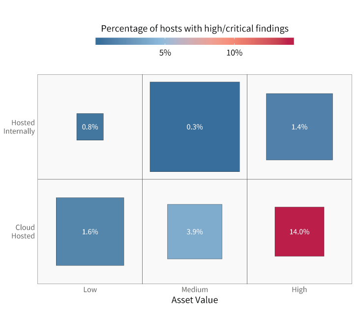
Healthcare’s severe finding rate for high-value assets in the cloud is 10x that of on-prem! That’s the largest on-prem vs. cloud exposure imbalance of any sector.
High-value assets collect sensitive information or authenticate user identity. Medium-value assets do not perform those sensitive functions but are network neighbors to those that do. Low-value assets are brochure sites that collect no private data and offer no foothold into the network. Figure 4 indicates healthcare firms host a majority of their Internet-facing systems on-prem but do leverage the cloud for low-value assets. It’s apparent that security exposures concentrate more acutely in high-value assets hosted in the cloud.
Given that cloud vs. on-prem exposure disparity, we feel the need to caution against jumping to conclusions. We could interpret these results to proclaim that the cloud isn’t ready for healthcare applications and should be avoided. Another interpretation, however, might suggest that it’s more about institutional readiness for the cloud than the inherent insecurity of the cloud. Either way, these results should encourage all healthcare organizations migrating to the cloud to assess their capabilities for handling the paradigm shift that is cloud security.
For those wondering how Healthcare’s “health chart” compares to other sectors, Figure 2 below is just what the doctor ordered. We’re not labeling exposure rates in this version because a) spacing issues and b) that’s not the point. The goal here is to aid general visual comparisons across sectors. It’s clear that no other sector matches Healthcare exactly. Sure, that bright red square for Hospitality suggests both sectors struggle to secure critical assets in the cloud, but the similarities end there. Bottom line—Healthcare faces some unique challenges with respect to managing its risk surface. And while that’s probably not news to anyone reading this, it’s helpful to see the data illustrate and validate those challenges.
FIGURE 2: COMPARISON OF SECURITY FINDINGS BY VALUE AND HOSTING MODELS ACROSS SECTORS
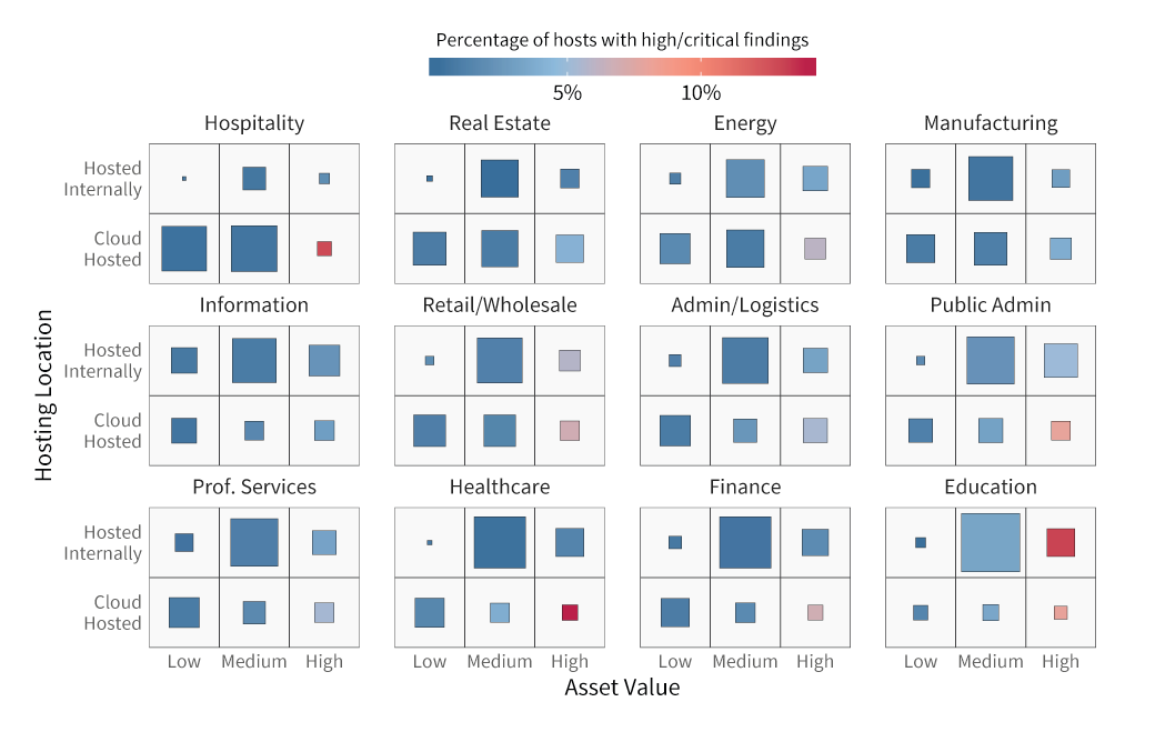
Figure 2 puts Figure 1 into a broader perspective. Healthcare exhibits the largest on-prem vs. cloud exposure imbalance of any sector.
It must also be noted that not all cloud environments are the same. Our Cloud Risk Surface report discovered an average 12X difference between cloud providers with the highest and lowest exposure rates. We believe this says more about the users and use cases of various cloud platforms than intrinsic security inequalities. At the same time, we recommend evaluating cloud providers based on features as well as resources they make available to assist customers in securing their environments. Certain clouds are undoubtedly a better match for healthcare use cases while others less so.
Download the report here to see the full findings from our study.


