When we think about risk, we also have to acknowledge and account for the inherent risk that is posed to your organization before any mitigation controls. The idea of inherent risk centers around the fact that we often use “common sense” risk factors to build a risk profile of a company before even undertaking any assessment. For example, if you are working with a partner that holds critical information, you may find yourself placing them toward the top of your inherent risk ranking, and pledging to keep a close eye on them.
Throughout this report, we’ll put our inherent risk bias to the test and consider some measurable aspects that might
influence an organization’s risk posture. Why? Because when we look at the measurable things about an organization’s risk posture, the same can be used to check for a correlation between the key performance indicators and risk surface.
INDUSTRY CLASSIFICATION
When assessing the risk of third parties, industry is often considered a major driver of risk posture. Research in the past shows that making those assumptions isn’t necessarily the most effective thing to do on this front and that the reality is much more complex.
However, while all industries have findings, some have substantially more than others. In order to take a closer look, we present Figure 5 which looks at the spread of findings across firms in different industries. This chart shows that while the median (typical) number of findings often does not vary hugely between the best and the worst groups within an industry, there is a huge variation in the overall number of findings found in firms.
CHOOSE…WISELY
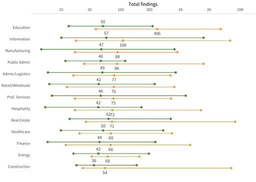 Education’s most challenged organizations have, at the low 5% level, just 38 findings. Whereas, at the 95% level of this same segment, there are 4,685 findings. Real Estate has an even larger range that starts at 26 and goes to 8,212 findings between the two extremes in the bottom performers.
This variance is also seen in the top performer category. So, while top performers seem to be better at managing their risks across the board, you cannot make assumptions based on industry alone.
Those looking for evidence to support assumption-based claims such as “universities always have poorer security than banks” won’t find them here. Instead, we see that the best performers in education are better than the worst performers in finance. Sure, the education sector as a whole may have the highest (read: worst) median density of high findings, while finance may appear much better on the list. However, there is a large amount of overlap between the two.
What does this mean? That there is far more variation within industries than between them. This is important because, typically, third-party risk decisions are made relative to a particular type of organization within an industry. The best partner in education might still manage risk better than the worst partner in finance. When you partner with a top-performing firm, you are more likely to have fewer findings, regardless of industry.
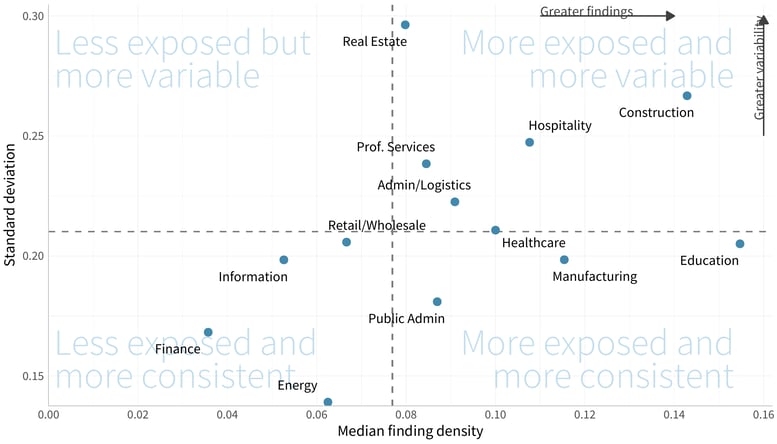
This tension between the number of findings and the amount of variability within industries is presented in the chart below. Looking at the finding density across industries, we can see how many key industries such as construction and education stand out from the rest of the pack.
We’ve divided it into four quadrants - less exposed and more variable, less exposed and more consistent, more exposed and more variable, and more exposed and more consistent. While construction is more exposed to risk, it is also consistently more variable, whereas education, while consistent, has much larger risk exposure. When your partners have more findings and more variability in their findings, you may find yourself in a position where you are taking on more risk than you may want.
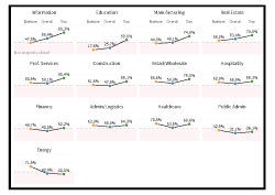
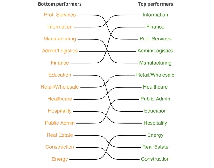
The next image expands on this trend with a little more detail - because who doesn’t love a ranking chart? When we look along the industry slices, we see that one in four businesses in the top performers ranking is either Information or Finance.
However, following Information over to the bottom performers’ column, we also find that it is ranked 2nd among the bottom performers. When we follow Finance, we have a bigger drop-off when we look at the bottom performers’ column, and the data tells us that one in 11 of the bottom performers is in Finance, i.e., a -162.8% change. This reinforces that, on the whole, Information and Finance industries generally have strong security practices. However, you cannot blindly apply that across the board to include ALL Information industry partners, since the Information industry also holds the silver medal amongst the bottom performers.
Education, on the other hand, has a large increase – 247% – in prevalence among the bottom performers. While 1 in 49 firms in the top performers is from the Education sector, Education makes up 1 out of every 14 of the bottom performers.
This could be due to various reasons such as a varying onboarding time for new technologies and risk mitigation strategies, a larger industry population, or a wider number of technologies that are in play within the industry. This clearly illustrates the vast range of variability within the industry.
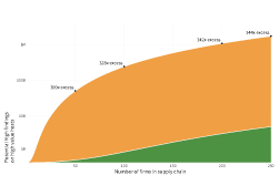
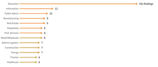 Before we wrap up our look at industry, let’s take a moment to look at the next chart to see what impact that choosing a bottom provider might have on your business. Just by taking a quick look, you can see the immediate impact. When you choose a bottom provider in Education, you are likely to have 43 times the amount of critical findings than when you partner with a top performer.
It’s clear that your partnering decisions do matter, but industry isn’t the end-all and be-all consideration. If you are a risk manager who is looking for a new partner, you’ll need to look beyond the industry before making your decision.
Download the full report here to see how you can understand and navigate the internet risk surface safely.